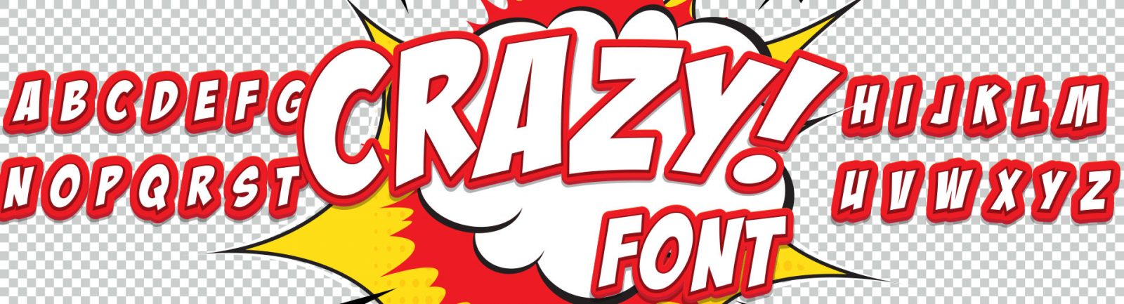

Or rather, you don’t pay attention to it consciously, as fonts usually influence how you perceive the layout, particularly when it includes a small number of illustrations; it is the font that can make the layout look elegant, modern or retro. Our creative director Marcin Rutkowski, who believes the choice of the right fonts is key, is not always able to let his imagination run wild at work, as most of our clients want us to use the fonts that are compatibile with their company or brand stylebook. This is obviously to prevent chaos and to support the company and brand’s visual identification, but sometimes you just feel like doing something differently:)
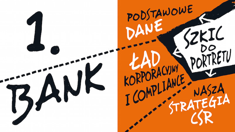
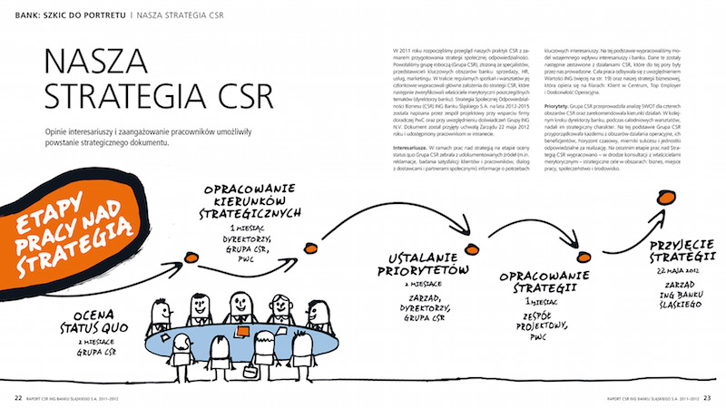
This was the case with the CSR report for ING Bank Śląski, when Marcin was able to go slightly beyond the fonts determined by the client. Based on the Desyrel font, he created a modified version which he used in the headlines opening each section. The font corresponded perfectly with the drawings used in the layout, and the report was a great success.
A year later our agency produced an analogous report, this time in the digital version – in this case the challenge was to keep the original character, as websites have more limitations than traditional paper publications, but we did manage to smuggle the characteristic elements in the captions under images.
We do understand, however, the need to use the fonts in a disciplined way; sometimes the comfort of users does not allow to use styles other than the most popular ones, e.g. when you make a presentation which has to be compatible with various users’ computers.
Too much diversity in public space leads to chaos, too, which already is a common problem in Polish cities. This is why we cheer for the non-commercial project Warszawskie Kroje (Warsaw Fonts) in which young designers led by Poland’s most experienced typographers and graphic designers (among the mentors running the workshops and meetings will be Michał Jarociński, Viktoriya Grabowska, Łukasz Dziedzic, Marian Misiak, Jan Franciszek Cieślak and Marcin Wawrzkiewicz) are going to create a series of ten new fonts based on the Warsaw typography traditions. The inspiration and foundation for the new fonts will be the historic lettering of Warsaw’s modernist neon signs, hand-written signboards, advertisements and murals from the communist times, as well as the disappearing tradition of city typography from 1920–1980. The new designs based on those traditions are going to give them a second life, bringing them back to public use. The fonts created will be open licensed and available for free. The project will continue through to the end of 2016 – we’ll keep you informed!
Warszawskie Kroje (Warsaw Fonts) project is organized by Stowarzyszenie Kulturotwórcze Miastodwa in cooperation with Design Crit. The project is co-financed by the city of Warsaw. It will be closed with an exhibition presenting the documentation and the designs created. Posters and brochures will be published promoting the new fonts and showing the examples of use. The brochures will be distributed along with the “Warsaw Guidebook for Good Practices in Signboards and Shop Windows Designing.” This way they will reach all Warsaw business owners renting premises from the city.
Kategorie: power of contentic