
 A (subjective) selection of the best magazine pages from last year by graphic designers Robert Wawryło and Marcin Rutkowski, and editor Kasia Petruk.
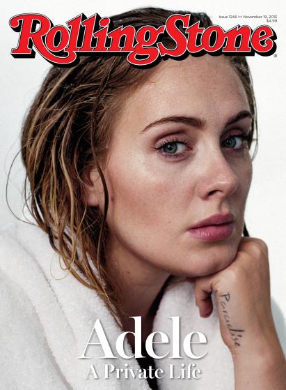
Rolling Stone, November 2015
Why? If you want to get the most out of a cover photo, get rid of all the surrounding elements – this principle always works. It gives the greatest focus on the main character. Instead of complicated or costly styling the impression comes from a deepened psychological study of the character. In this case, the idea was for a simple, naturalistic portrait of Adelle after hours, as if she just got out of the shower. The impact of that face and her look is immense.
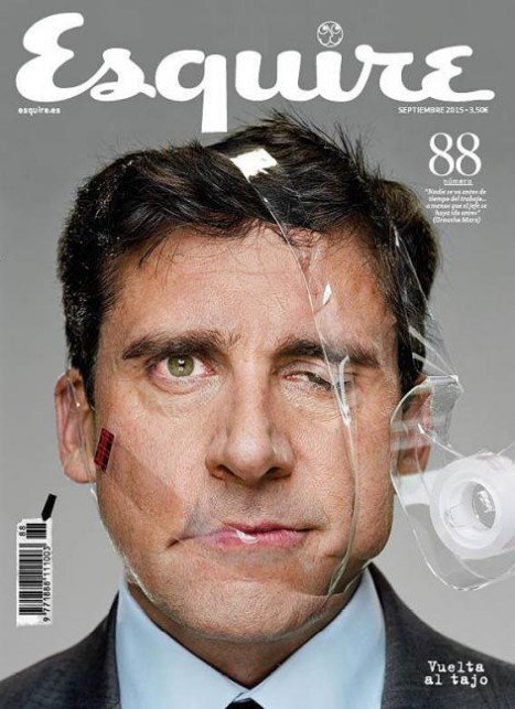
Esquire (Spain), September 2015
Why? A realistically provocative image of Steve Carell with his face deformed by sticky tape. Unlike in the previous example, the seriousness is gone, so what has been achieved is more than realism. They say not everyone would agree to have such a painful and naturalistic portrait taken. This is neither comfortable nor photogenic. What we can be sure of is that both the model and the one who came up with this idea maintain a healthy distance.
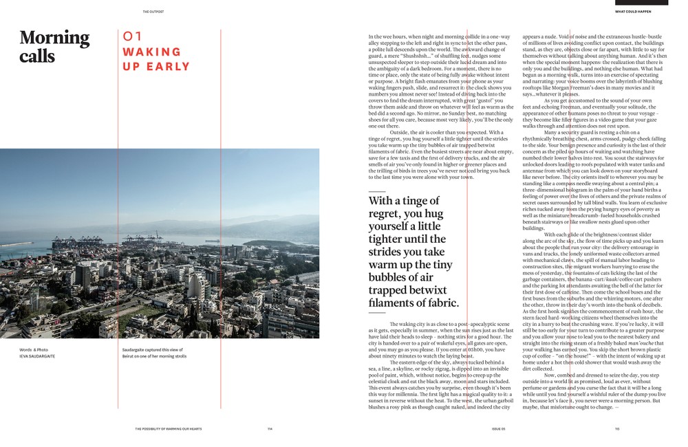
The Outpost, September 2014/March 2015 #5
Why? This is a great example of simple yet unusual column design. Classic and minimal typography in a provocative layout. The column grid is normally only seen by graphic designers. Here it’s different. The designer is showing us the division. As if that was not enough, part of the layout was based on this visible three-column grid, but it was completely ignored later on, leaving only the construction lines visible. This brings a surprising anti-canonic effect. With all the extreme minimalism of this page, the result is ground-breaking and jaw-dropping, but without too much color or topping – just a rebellious idea.
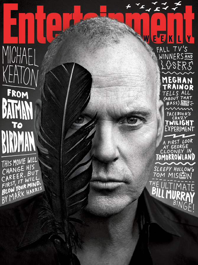
Entertainment Weekly, October 2014
Why? Some of us decided to expand the time limit of our summary for this cover. 2014 was a great comeback of former Batman – Michael Keaton, this time as Birdman. A magical realism portrait. Our attention is drawn to unusual font and arrangement of cover headlines. This is always a challenge for designers and editors because we’ve seen it all. In this example, the headlines are an integral element of the image (creating an even pattern in the background) and they also agree with the styling of the movie itself. In the era of 3D and high-end computer technology this trace of hand-made typography looks convincing and does not leave you indifferent.
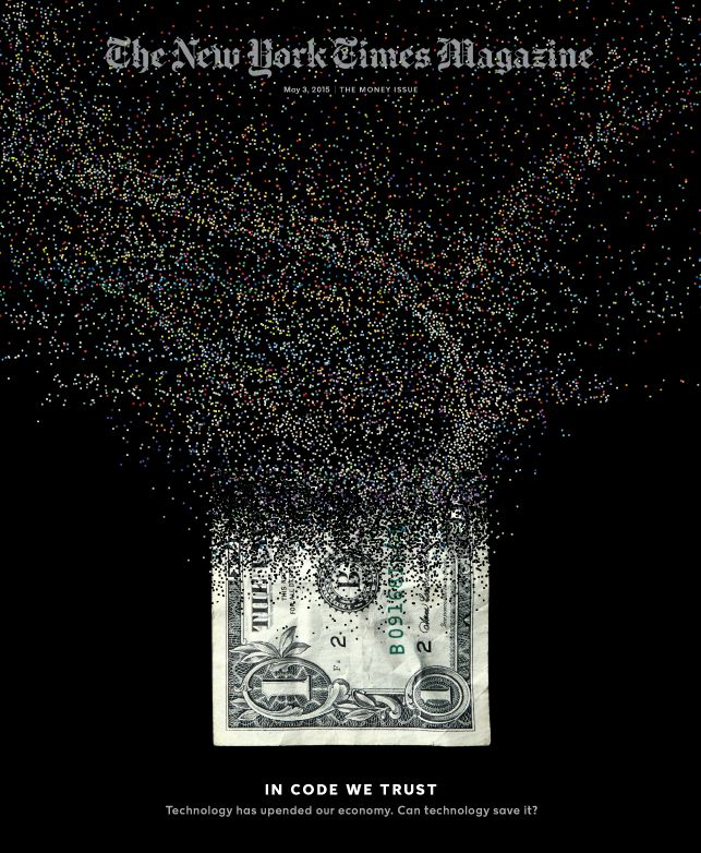
New York Times, May 2015
Why? A complex economic story presented in a very effective but minimalistic way, which by the way is often NYT trademark. The image is formally very simple, even ascetic. Its massage is ambiguous and it does not answer the question asked. We can intuitively grasp the meaning – a banknote turning into a virtual form. Question: is it going to vanish completely?

Lagom, March 2015
Why? Classic elements but used in slightly different proportions than we got used to. First, the dominant message of the image. All other elements dominated by the photo of a cyclist. Spreading the photo on two facing pages, especially when it corresponds with the headline (Back in the Saddles) is a strong entry for the article. What’s also interesting is the classic two-element typography – nobody says anymore that two-element serif typeface looks old-fashioned. On the contrary, when we use it with an unusual proportion canon, we get a new modernist quality. Here the element violating our esthetic sleep mode is the size of the footer, almost equal to the font size of the headline.
Honorable mention
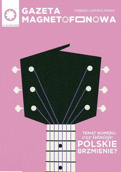
Gazeta Magnetofonowa, December 2015
Why? New independent magazine about music – known only to the insiders (as for now). The cover following retro styling was designed by one of Poland’s leading young illustrators, author of numerous concert posters, Dawid Ryski. A simple and clear combination of two elements: music and Poland. Just like the good old Polish school of poster art.
Kategorie: power of contentic