
I get an article, a few photos and instructions to create “a nice looking” graphic… Bang! There goes the first mine. The customer is alive, but he’s going to have a limp leg for the rest of his life. Why? What happened? A graphic designer is completely lost when faced with the expression “nice-looking graphic,” so he starts groping. Naturally, the customer does not get anything like the image which he saw with the eyes of his imagination, so he’s just a step away from frustration. After this experience he feels almost physically injured. Of course, neither of us wants that – neither the customer nor the graphic designer.
A designer creates the artwork – an outfit for the message the customer wants to convey. The more tasteful it is, the greater the joy of the reader, but first of all, it has to be functional: the sleeves can not be in the place of the pockets, and you can’t replace the collar with, let’s say, a leg.
What we need to do, is to create a graphic representation for the hierarchy of the consecutive points of the message. The reader must be able to look at the graphic and pay attention to the pieces composing a logical whole.
The best example of a consistent visual message that leaves you with no doubts at all, is a road sign and all the visual communication systems. When you see an arrow pointing upwards, you know you must go straight, if it points to the right – you know you must turn this way. Simply by following those rules you are very likely to get to your target safely. We don’t think about the shade of the blue or green color used in the background, or if the contrast between the background and the icon isn’t too big. We read the message automatically, we access its meaning naturally and effortlessly.
The goal of artwork is to convey message in a way that is easiest to understand. True, it should be tasteful because it draws our attention to the text, and we shouldn’t fear that our eyes will hurt or that the image is going to haunt us at night. But by telling the designer to “make it nice,” you are just telling him to “do anything,” because the word “nice” carries little content, and a lot of expectations. “Nice” means something different to everyone. It’s probably one of the most abstract words in any language…
Dear Customer, before you start talking to a graphic designer, think about what you want to achieve with your project. What is most important in the message you want to convey? Is your message logical, giving you a chance to really get through to the reader? Believe me, if your idea is more chaotic than consistent and it lacks a clear conclusion – even an army of the world’s best graphic designers won’t help. Instead, you’ll see the mines of frustration, lost time and money go off one after another. If you’re lucky, you will not step on the mine of mutual dislike – which makes you particularly prone to injuries due to frayed nerves.
Thus we are approaching the first painful truth – if you want to develop a successful and most effective message with a graphic designer (that’s right, you’re in it together), you need to know exactly what you want to achieve. Or at least, what you would like to achieve, in which case you must be prepared to spend more, because the less specific you are, the more time and work it takes to formulate your message.
And one more thing… For your own good, please, do not use the word “nice.” Forget about it if you want to be successful. Marry thinks pink dots are nice, but Kate sees them as extremely hideous and a proof of tastelessness. And they’re both right. “Nice” will only push you further into the minefield, which I guess is not where you want to go.
Be as specific as you can. Focus on what is most important in your message. Try to limit the number of words. Choose logical gradation of the consecutive points instead of ornate language. Use simple words and expressions that will be clear to everyone without the need to look up things in a dictionary. And by the way, I truly recommend cooperating with an editor or a copywriter, people who deal with words professionally.
Think about the form your message should take and why. Is it better to choose a poster, a brochure, or maybe electronic form? Emailing, a presentation, or maybe landing page? Or maybe several of them, or even all, plus dedicated advertising gadgets? What strategy do you want to take to reach the right audience? Done? Good. Now do it again!
And now, armed with the awareness of the meaning of your project, a mine and consolidated content detector, and a kevlar helmet of clearly defined goal, you can boldly enter the minefield – and talk to the graphic designer.
Dear Customer, using as many details as possible, tell the designer about your goal and the target group of your communication, for which the designer is going to create the artwork. And no, it’s not intended to let him “steal” your business model for winning the world that you’ve been developing for years.
Trust me, a graphic designer has no time for industrial espionage. His job is so time consuming that he wouldn’t have time to use your ideas for himself. This is all he is: a graphic designer – not a super spy from the Secret Business Plan Thieves Organization. And so:
You’re now on the good path. You and the graphic designer have agreed on the form, you know that you’ll get the best result from a combination of posters, handouts with detailed information, a simple animation and an emailing campaign. You already know why it’s good to create a website for your project to include all the detailed information and user-friendly infographics. You’ve decided on the formats, or the size of each of the above mentioned forms. The designer knows the objectives and the goal of your campaign and gets to work. After some time, you get the first proposals. You watch them, think about them, you show them to your family at night and ask them for opinion. And here’s where the problems start, because:
Completely devastated, you decide it is absolutely necessary to make dramatic changes, you begin to feel irritated because the campaign should set off in the beginning of the month, and you’ve already lost a whole week. You go back to the graphic designer and…
…you strongly demand that the shades of blue are changed to pink, and that the font is bolded and possibly darkest black. You also demand the font to be bigger. You add a few doubts regarding the content, such as: why the poster, the animation and emails do not provide all the information from the handout? No more playing around, mister graphic designer, you need to fix this. And enlarge the logo, just remember about the protective field (whatever it means).
Let’s think about it for a moment. Using the analogy with a mechanic: when your lambda sensor breaks down (whatever it is), are you really going to tell the mechanic how to unscrew all the bolts, how to remove the broken part and replace it with a new piece? Are you going to tell him to replace the engine in your sedan with one taken from an F1 bolide, just on the fly? Is it going to be better this way? Is it going to work? I think even your favorite mechanic would tell you to take a long and exciting walk in this case.
But let’s be reasonable. You would never think about telling the mechanic how he should perform his task. He knows so well what to do. In fact, you have no idea what he’s doing to your car, just as he doesn’t know a thing about your job – an expert on strategic investments for the energy security sector. And that’s fine, isn’t it? It works. He successfully fixes your car, you make sure he has power, and neither of you knows what the other one is actually doing. But it works. And it works just fine, doesn’t it?
It is similar when you cooperate with a graphic designer. Seriously! He knows exactly why, in your campaign about the neighboring countries’ foreign policy’s influence on the national energy security, he used the shades of blue and grey, and why he introduced some brick red to put more focus on the key text fragments. He didn’t use pink (which your child loves so much) deliberately and consciously. Simply because he’s developing serious materials and not an invitation to Sophie’s 16th birthday. And yes, colors do have a huge impact on content reception. They impose the way it is interpreted and build the atmosphere. And yes, there is a thing called the psychology of colors. It is a powerful, scientific tool allowing you to obtain your content related goals in a consistent way.
From the designer’s point of view, an equally important role is played by the forms, contrasts, light, proportions and the arrangement of various layout elements, so called composition. All this impacts the reception’s dynamics – the design’s readability, to put it simply. This is all to make the message easy to digest by the reader, instead of causing heavy indigestion and making you lose the audience as a result.
The designer has more such tools at hand to “shape” the project the way you want it to be. And trust me – he is skilled at using them.
There is a reason why the poster he designed for you contains only the main slogan of the campaign and one short sentence that sends the reader to a detailed handout for more information. OK, it also includes your phone number, website address and your email.
There is a reason why the 15-second animation uses only a few words along with the campaign slogan.
And there’s also a reason why the designer tried to convince you to leave those words out anyway, in order to focus on the emotions evoked by the image, but you persisted on pointing to the 34 main advantages of carrying out the project promoted by the campaign.
There is a reason behind putting the details on a folded handout, which by the way has far less information than you suggested.
And there is a reason why he convinced you to create a website with all that information along with the charts and numeric data.
A graphic designer knows perfectly well the role played by different forms of communication in the process of conveying information. He is aware of the differences in the way information is read when provided via poster, handout, animation or website. Even if he still does not have the slightest idea of what the lambda sensor is – he knows the best possible form for conveying the information you want to reach your readers with.
Dear Customer, if you really want to create the best possible graphic form for your content and make it most impactful, trust your graphic designer. Trust his knowledge and skills. Just as you trust your favorite mechanic or your family doctor, who has been taking care of the health and proper development of your kid for years.
Of course, you need to tell him as much as possible, talk with the designer about the project, ask questions and discuss. Tell him about your doubts. But please, do not follow your personal taste when working on commercial projects. Next to an unclear goal, this is the second most frequent and fatal mistake that you can make when developing artwork for your projects. Focus on your goal, on making communication clear and consistent, and forget your favorite color. Unless we are creating an invitation to your child’s birthday. But even in this case, it is worth trusting the designer and letting him do his job after telling him about your expectations.
Naturally, just as there are some less skilled mechanics, there can be a not very skilled designer. But this is a subject for a completely different conversation…
Define in detail what you want to do. Think about the forms you want to design and their destination.
Format difficulties
Think about the formats – for instance, if you want to make a poster, decide on its format (size) and orientation (vertical or horizontal.)
Remember that not all formats have the same proportions. Scaling a design of A2 format into A4 won’t be a problem, but scaling it from A4 to A2 can pose a technical problem, because the photos used for the A4 format may have technical parameters that won’t be enough for printing them in A2.
Always focus first on the largest format you are going to need.
You will also come across other problems when changing proportions or orientation.
Vertical and horizontal forms are designed differently.Different orientation requires different way of thinking about the proportions and building a harmonious whole, which means a poster designed vertically is going to look good, but no longer so after changing its orientation to horizontal, and it may be necessary to design it anew, e.g. using different photos.
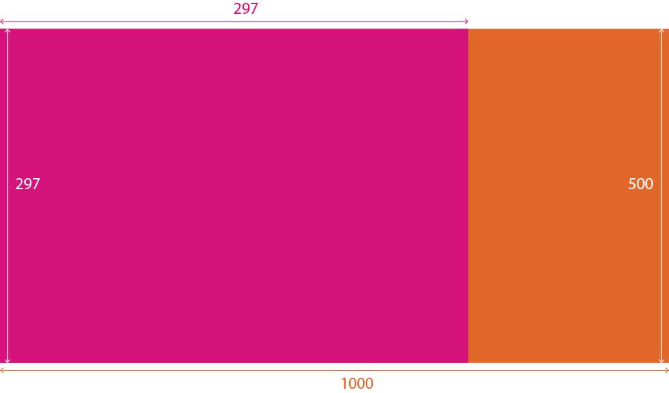
For instance, if you ordered a poster which has 500 mm in the base and 1000 mm in height, you must be aware it won’t be scalable to standard A series formats (e.g. A4 – 210mm/297mm) due to its different proportions. It will need redesigning.
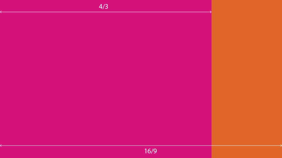
The same rule applies to designing electronic materials. Even though in this case most formats are horizontal, there can be huge differences in the proportions – an image in 4:3 format is close to a square, while the 16:9 format is a panoramic view. It clearly impacts the designing process and definitely limits conversion possibilities without impairing the design’s quality. In which case it will be easier, faster and more effective to design the form anew than to stuff excess content or the other way round – to expand not enough content.
“Forced” scaling when the proportions or, even worse, the orientation is different hardly ever brings satisfying results, and you are likely to have the impression that “something’s not right” in comparison to the original design.
Remember! Defining the format and orientation has huge importance for the clarity of the design. And so, for instance, posters tend to look better in vertical orientation that the user is simply used to, while horizontal forms look better in electronic messages. This is of course enormous simplification, but it’s a good starting point for deciding on the right orientation for the designed form.
Let’s talk about… content
The key element is to prepare content with regard to what form you are going to use for the project. While developing content, you should think about it differently when designing a poster, a handout, animation, than when working on a website, a brochure or a magazine.
Each of these forms conveys content differently, and reaches the audience in a different way.
To put it simply, a website is like “rubber” and can accommodate any amount of content (another thing is if you can organize it in a comprehensible way and divide it in a logical way, so that the reader does not feel lost in the multitude of information.)
A magazine or a brochure will also accommodate a lot of information, but the volume is much more limited with the number of available pages, their format, the size and type of fonts, and the number and size of images. Still, with these forms you can think about providing quite a lot of detailed information.
A handout will seriously limit the volume of your content. But then, its task is not to provide the content of two volumes of Encyclopaedia Britannica – it should explain the very basic matters and make the audience interested enough to use your services or buy your product, or to visit your website for more details. Or to simply visit your company, where they can find out more and use your product or service.
Poster and animation – this is the place to use simple slogans. They should be catchy enough to make the viewer want to find out more (see above.)
None of these forms has room for detailed descriptions or explaining why the engine produced by your company is a breakthrough and how it is head and shoulder above the competition. One slogan, catchy campaign claim, and playing with the audience’s emotions with a well composed image. A short and clear link to the forms or places where they can find out more. That’s all. This is definitely not the place for charts, whole paragraphs of text or explanations. These two forms are exclamation marks.
This very simplified organizing of content, depending on the form that will carry the content, will prevent you from getting lost in the multitude of the available means of communication, and from damaging the design by making it too wordy. If you manage to divide your content in a logical way to make it fit the form you want to reach your audience with, you are very likely to draw their attention. And to make your campaign effective, so that it’s not a waste of time and money.
Kategorie: school of contentic, B2C